The MACD is one of the most popular momentum indicators, and while its name sounds technical, its idea is simple: it measures the relationship between two moving averages to show whether momentum is building or fading. It packs three related pieces into one panel below the chart, and once you know what each does, the MACD becomes an easy read. Here is how the MACD line, signal line, and histogram work together.
The MACD line
The MACD line is the heart of the indicator, and it is simply the difference between a faster moving average and a slower one, typically a 12-period and a 26-period EMA. When the fast average is above the slow, the MACD line is positive; when it is below, negative. As momentum builds in one direction, the two averages spread apart and the MACD line moves further from zero. So the MACD line is really a measure of momentum distilled from two moving averages.
The signal line and histogram
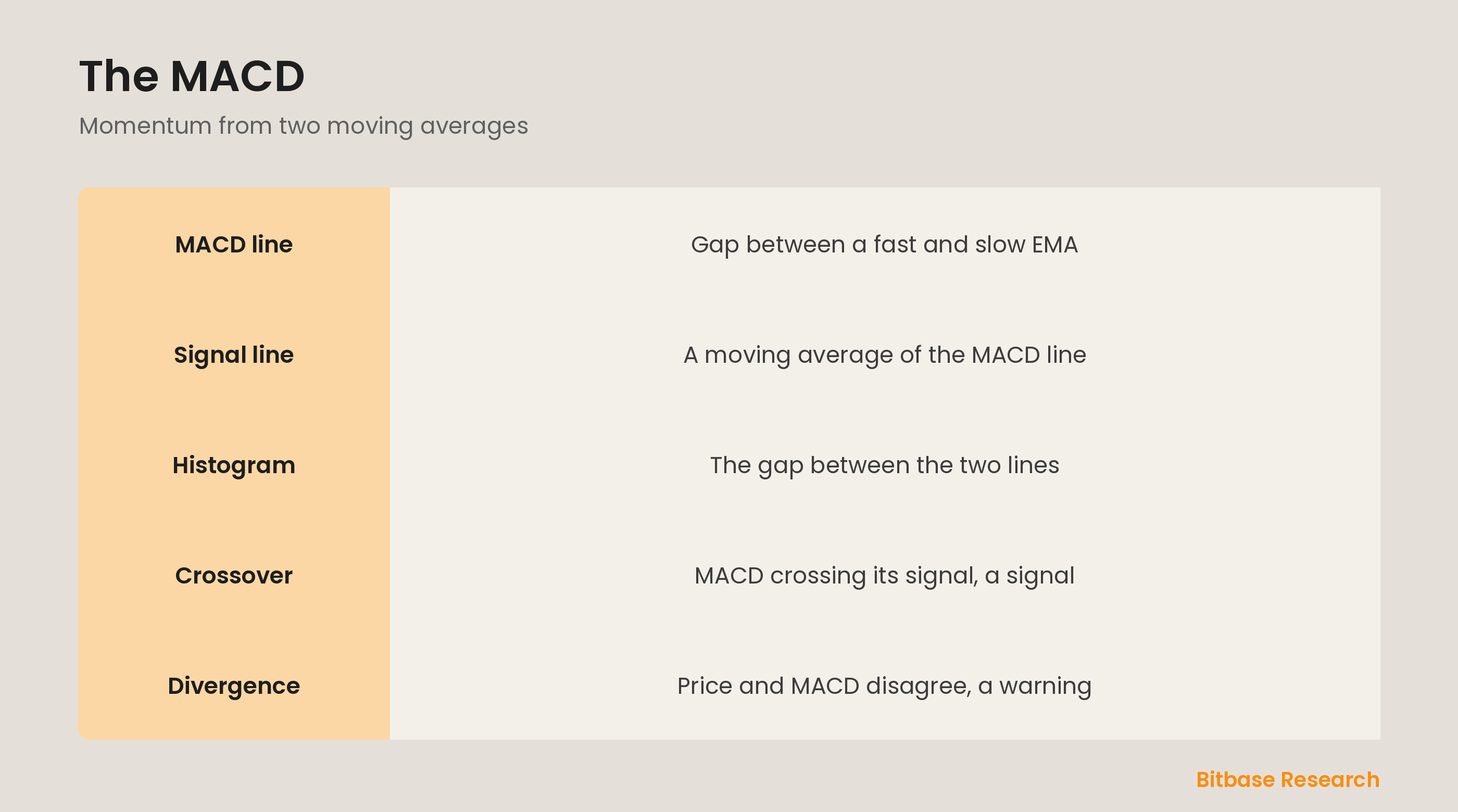
Two more pieces make the MACD useful. The signal line is a moving average of the MACD line itself, a smoothed, slower version that lags it slightly. The histogram is the gap between the MACD line and the signal line, drawn as bars. When the MACD line is above its signal, the histogram is positive and growing bars show strengthening momentum; when below, negative bars show weakening. The histogram gives you a quick visual of momentum shifting.
Crossovers as signals
The most common MACD signal is a crossover of its two lines. When the MACD line crosses above the signal line, it suggests momentum is turning up, a potential bullish signal; when it crosses below, momentum is turning down, a potential bearish one. These crossovers are visible on the histogram too, which flips from negative to positive or back at the crossover. Like all crossover signals, they can lag and misfire in choppy markets, so they are best confirmed.
Divergence as a warning
One of the MACD's most valued uses is spotting divergence, when price and the MACD disagree. If price makes a higher high but the MACD makes a lower high, momentum is weakening even as price rises, a bearish divergence that warns the uptrend may be tiring. The reverse, price making a lower low while the MACD makes a higher low, is a bullish divergence. Divergence does not time the turn precisely, but it flags fading momentum beneath the surface.
The bottom line
The MACD measures momentum from two moving averages. The MACD line is the gap between a fast and slow EMA, the signal line is a smoothed version of it, and the histogram is the distance between them, showing momentum strengthening or weakening. A crossover of the two lines is a common momentum signal, and divergence between price and the MACD warns of fading momentum. Like any indicator, it works best confirmed by context rather than traded alone. To keep learning the fundamentals, follow more from Bitbase Academy.
Disclaimer: This article is educational content from Bitbase Academy, provided for information only. It does not constitute investment, trading, tax, or financial advice. Crypto assets are volatile; assess your own risk. Written as of June 2026; refer to the latest official information.
References
[1] Investopedia, "MACD: What It Is and How to Use the Indicator" investopedia.com
[2] Investopedia, "Exponential Moving Average (EMA): Definition and Formula" investopedia.com
[3] Investopedia, "Technical Analysis: What It Is and How to Use It" investopedia.com